“Elements that are placed close to each other are perceived as being more related than those spaced further apart.” – Gestalt Principle of Proximity
1. What is the Law of Proximity?
As one of the most powerful Gestalt Principles, the Law of Proximity states that physical distance determines visual relationship. In digital strategy and UX architecture, proximity dictates that whitespace is not empty canvas—it is an active structural element used to organize information. Understanding this allows design leaders to move away from cluttered, disorganized interfaces and engineer digital products with commanding executive presence, guiding users naturally toward high-value conversions.
2. The Core Concept: Spacing as Invisible Glue
The human brain processes structural clusters long before it reads specific text or evaluates individual pixels. How you manage the space between elements directly impacts a user’s cognitive load and ability to take action.
- Users instantly assume that items grouped closely together share a functional or contextual relationship.
- If a layout lacks distinct spacing, the brain is forced to work overtime to figure out which headline belongs to which paragraph, or which button submits which form.
- When proximity is executed flawlessly, the interface feels deeply intuitive and high-contrast, accelerating time-to-value and directly improving ROI by reducing user drop-off.
3. Key Takeaways for UX Designers
- Weaponize Whitespace: Treat spacing as your primary organizational tool. By increasing the margins between distinct sections (macro-whitespace) and tightening the padding between related items (micro-whitespace), you create an instant, readable hierarchy without adding extra visual weight.
- Cluster Actionable Elements: Never orphan your Call-to-Action. Ensure that primary buttons, form inputs, and their corresponding labels are grouped tightly together so the user’s eye naturally flows from the context to the conversion point.
- Define Clear Visual Boundaries: Use proximity to separate competing information. If you have two different pricing tiers or product features, generous spacing between them prevents visual bleeding and clarifies the user’s choices.
4. Real-World Examples
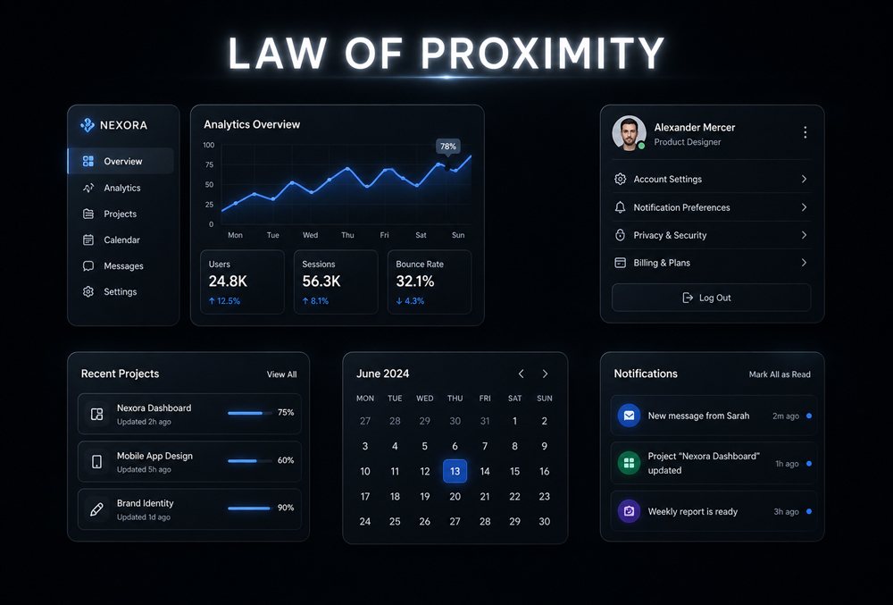
- E-Commerce Product Cards: High-performing online stores rely entirely on proximity to make browsing effortless. A product image, its title, the price, and the “Add to Cart” button are clustered tightly into a single card, with significant space separating it from the adjacent product. The brain instantly processes this cluster as one purchasable unit.
- High-Converting Typography: In authoritative editorial and business-first content, the spacing between a headline and its subsequent paragraph is much smaller than the spacing between the end of that paragraph and the next headline. This simple application of proximity ensures the user never questions which text belongs to which section.
- Enterprise Navigation Menus: B2B SaaS platforms use proximity to categorize complex features. Primary features are grouped closely on the left, while secondary actions (like settings or profile management) are clustered far to the right. The physical distance communicates a clear difference in function.
5. How to Handle “The Fear of Scrolling” (Managing False Density)
The biggest trap with the Law of Proximity is “The Fear of Scrolling”—where stakeholders demand that all information be crammed “above the fold” to maximize visibility. This destroys proximity, creating a chaotic, overwhelming wall of text that severely spikes cognitive load. You manage this by advocating for Structural Hierarchy over Density. Emphasize that users are perfectly comfortable scrolling if the layout is highly readable. Use generous whitespace to protect the relationship between critical elements, ensuring that the design retains a minimalist, high-contrast aesthetic that commands authority rather than inducing anxiety.
Summary for Designers
“Design for intuitive navigation by using space to define relationships; what sits together, works together.” By mastering the Law of Proximity, you eliminate visual confusion and engineer a frictionless user journey. Focusing your design strategy on intentional spacing reduces cognitive friction, elevates the perceived quality of the brand, and ultimately drives measurable business outcomes.