“Entities should not be multiplied beyond necessity.” – William of Ockham
1. What is Occam’s Razor?
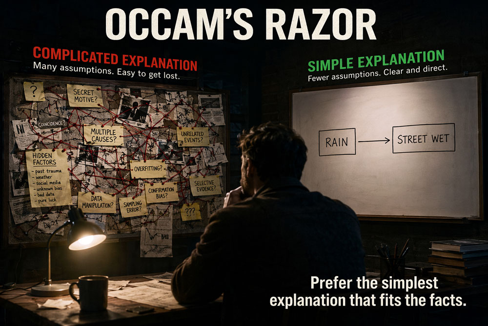
Occam’s Razor is a foundational philosophical principle dating back to the 14th century, which establishes that when presented with multiple competing hypotheses or solutions, the simplest one is almost always the best. In modern UX architecture, this translates to a ruthless reduction of complexity. It dictates that designers should eliminate all unnecessary elements, steps, and visual noise without compromising the overall function of the design. This isn’t just about making an interface look “minimalist” or clean; it is a critical driver for reducing cognitive overload, keeping users focused in the conversion funnel, and building highly intuitive, high-ROI digital products.
2. The Core Concept: Cognitive Load and Conversion Retention
Interface simplicity directly dictates whether a user stays engaged or abandons your platform. When users are presented only with the exact elements they need to achieve their goal, they enter a highly productive “state of flow.”
- They experience immediate decision fatigue and are highly likely to bounce if a page or process confronts them with too many competing calls-to-action, directly bleeding potential revenue.
- They completely lose their context and abandon complex tasks (like multi-step checkouts or enterprise configurations) if forced to process redundant information or unnecessary visual clutter.
- They experience a frictionless, high-converting journey when the system cuts out the noise, making the digital product feel incredibly straightforward, reliable, and effortless to use.
When you architect solutions optimized for absolute simplicity, you stop relying on users to figure out your interface and instead use clarity to drive decisive action and task completion.
3. Key Takeaways for UX Designers
- Ruthlessly Prune the Interface: Evaluate every single button, icon, image, and line of text. If an element does not directly support the user’s primary goal or provide critical context, remove it. Every added element degrades the visibility of the others.
- Engineer Shorter User Journeys: Analyze your user flows and eliminate unnecessary steps. Do not ask for information you do not strictly need right now (e.g., asking for a billing address when offering a free trial). The fastest way to conversion is the straightest line.
- Deploy Progressive Disclosure: For complex applications, hide secondary or advanced features behind “More” menus or advanced settings. Show the user only the core essentials upfront to maintain their momentum, rather than forcing them to parse through advanced options they don’t yet need.
4. Real-World Examples
- High-Volume E-commerce (Guest Checkout): On high-converting platforms, forcing users to create an account is bypassed in favor of a “Guest Checkout” option. The system doesn’t demand unnecessary password creation or profile setup before visually confirming the purchase, eliminating a massive friction point.
- Search Engines (The Google Homepage): The ultimate execution of Occam’s Razor. Despite offering dozens of complex products and tools, the primary interface is stripped down to a logo, a search bar, and two buttons. This instant clarity prevents decision paralysis.
- FinTech and Banking Apps (One-Tap Transfers): Modern banking apps have replaced complex routing interfaces with simple “Send Money” home screens that highlight recent contacts. Selecting a face and typing a number achieves what used to take five distinct screens of data entry.
5. How to Handle “Necessary Complexity” (Managing Friction)
Because Occam’s Razor demands the elimination of the unnecessary, inherently complex processes—such as enterprise software configuration, tax filing, or deep data analytics—present a critical friction point. To handle this, you must aggressively manage information density. If you cannot remove elements because they are fundamentally required, you must chunk and sequence them. Replace dense, overwhelming single-page forms with a guided, step-by-step wizard. This transforms a massive, anxiety-inducing cognitive load into a series of simple, highly focused micro-interactions that retain user trust and momentum.
Summary for Designers
“Design for maximum clarity by eliminating all unnecessary elements, steps, and visual noise to sustain user flow and maximize conversion rates.” By rigorously applying Occam’s Razor, you stop diagnosing superficial aesthetic issues and start resolving the deep, structural friction points (like choice paralysis and cognitive overload) that impact usability, scale, and business ROI.